01Creative DevelopmentLive
Chronos
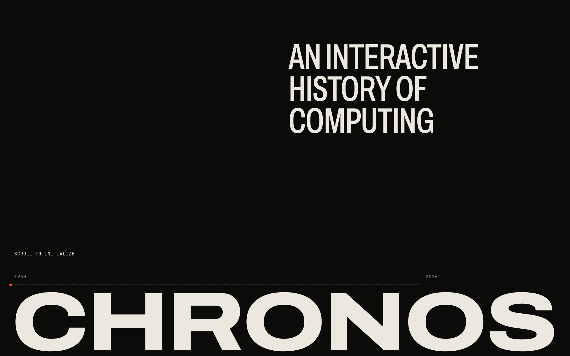
An interactive history of computing: scroll-driven storytelling, kinetic typography and a persistent visual signal that transforms across technological eras.
- Role
- Design & Development
- Year
- 2026
- Stack
- Next.js, React, TypeScript, Tailwind CSS, GSAP, ScrollTrigger, SVG, CSS, Vercel
Overview
Chronos: An Interactive History of Computing is an interactive web experience about how computing evolved, from room-sized machines to the systems in use today. It is a personal project: designed, built and deployed independently.
The story runs from 1940 to 2026 in nine chapters: Initialization, Machine, Chip, Personal Computing, Web, Always On, Everywhere, Intelligence and a Finale. The question behind it is how we got here, and it closes by asking what comes next.
It is not a conventional timeline. Scrolling drives the narrative: each era is a composition of type, grids and SVG structures that transforms into the next one, so the reader moves through the history instead of reading a list of dates.
Problem
How can decades of computing history be told as one cohesive interactive experience rather than a conventional timeline? The scope is large and the eras look nothing alike, so the piece needed visual continuity, motion complex enough to carry the story without hurting readability, a version that works on mobile, and content that never depends on animation.
Solution
An art direction called Computational Archaeology: the interface behaves like a digital system reconstructing the history of computing. The visual language is deliberately constrained to near-black backgrounds, warm off-white type in Archivo and JetBrains Mono, technical grids, coordinates, nodes and circuit traces, all drawn with CSS and SVG and without photographs. Eras transform into one another instead of appearing as isolated sections.
Result
A published, self-contained creative frontend experience, with no custom backend, database or CMS. It brings together frontend engineering and editorial motion design: TypeScript, React and Next.js, a visual system built with CSS and SVG, a responsive implementation and a reduced-motion alternative.
Features
Persistent Signal: one visual primitive runs through the whole experience and changes meaning as it goes. It starts as an initialization signal and becomes an electrical path, a circuit trace, a pixel and interface structure, a network edge, a continuous data flow, a device boundary and, finally, the relationships between pieces of information. It is a narrative device, not a decorative line: it is what connects eras that otherwise have little in common.
Motion system: GSAP, ScrollTrigger and @gsap/react drive pinned sequences, scrub-driven transitions, SVG path drawing, scale transformations and kinetic typography. The eras transform into one another, such as Machine into Chip or Web into Always On, and the technique varies from section to section.
Typography as structure: oversized editorial type in Archivo carries each chapter, with JetBrains Mono for labels, periods and coordinates. Negative space and technical grids do the rest.
Responsive design: desktop, tablet and mobile each have an adapted experience. On mobile, sequences are simplified where necessary instead of reproducing the desktop effects at a smaller scale. Layouts were validated at 1440px, 1024px and 390px.
Reduced motion: with prefers-reduced-motion enabled, the alternative is structural. Narrative pins are disabled, complex scroll timelines are skipped, and the content and SVG compositions stay visible and readable. Nothing depends on animation to be understood.
Keyboard and focus: the Restart control at the end returns to the top, moves focus to the main heading and keeps a visible focus indicator.
The historical content draws on published references, mainly the Computer History Museum and CERN. The decades are editorial anchors, not strict historical boundaries.